

Click on the Y-axis.
Question 1
I'm sorry, you didn't click on one of the axis. Please try again.
Click here to return to question 1.
Question 1

Yes, you chose the green axis, and the Y-axis is the verticle axis.
Click here to return to question 1.
Click here to go to question 2.
Question 1

NO, the Y-axis is the verticle axis (runs up and down), you clicked on the horizontal axis (runs left to
right. This is called the X-axis.
Click here to return to question 1.
Question 2

What are the units of the Y-axis?
(A) Individuals
(B) Frequency
(B) Proportion
(C) None of the above
Yes, the units on the Y-axis are individuals. Because the values are given in whole numbers rather than percentages you know it can't be a frequency.
Click here to return to question 2.
No, frequencies must be between 0.0 - 1.0. Since the values on the Y-axis are in whole numbers they can't be
frequencies.
No, proportions must be between 0.0 - 1.0. Since the values on the Y-axis are in whole numbers they can't be
frequencies.
No, one of the answers is correct.


No, this graph does not have any of the variables transformed. Typicall if the variable is transformed you can
tell because the scale looks different.
Yes, this graph has had its X-axis log10 transformed. You can tell this because it is an equal
distance from 1 - 10, as between 10 - 100, and 100 - 1000.
Other graphs also have transformed data, have you found them all?
No, this graph does not have any of the variables transformed. Typicall if the variable is transformed you can
tell because the scale looks different.
Other graphs also have transformed data, have you found them all?
Yes, this graph has had its Y-axis log10 transformed. You can tell this because it is an equal
distance from 1 - 10, as between 10 - 100, and 100 - 1000.
Other graphs also have transformed data, have you found them all?
Yes, this graph has had its X-axis log10 transformed. You can tell this because it is an equal
distance from 1 - 10, as between 10 - 100, and 100 - 1000. Any type of numerical data can be transformed, so
don't let the units fool you.
Other graphs also have transformed data, have you found them all?
Yes, both of the X- and Y-axis have been log transformed using base 10. You can tell this because it is an equal
distance from 1 - 10, as between 10 - 100, and 100 - 1000.
Other graphs also have transformed data, have you found them all?

No, you can always tell how many different groups of data there are by the number of different symbols on the
graph. On this graph there are more than 1 types of symbols.
No, you can always tell how many different groups of data there are by the number of different symbols on the
graph. On this graph there are more than 2 types of symbols.
Yes, there are three different symbols on the graph, thus there must be three different groups of data the
scientist wants us to notice.
No, you can always tell how many different groups of data there are by the number of different symbols on the
graph. On this graph there are less than 4 types of symbols.

What is the shape (also called distribution) of the data like in this graph?
(A) Normal
(B) Uniform
(C) Skewed
(D) Bimodal
Yes, a normal distribution is bell shaped. That means that most frequently observed value is the mean value.
Click here to go to question 6.
No, a normal distribution is bell shaped, like the graph above.
You said that this was a uniform distribution. In a uniform distribution all values are observed with equal
probability, so the graph would look like this,

No, a normal distribution is bell shaped, like the graph above.
You said that this was a skewed distribution. In a skewed distribution the shape is more like a deformed bell
where on side (tail) is stretched out further than the other side. The distribution is said to skewed towards the side
that has the longer tail. For example, a right skewed distribution would look like this,

No, a normal distribution is bell shaped, like the graph above.
You said that this was a bimodal distribution. In a bimodal distribution there are two peaks in occurances, so
you should see two humps or spikes. For example, a bimodal distribution would look like this,

Question 6

Click on the axis that represents the independent variable.

Yes, you said that the independent variable was the green line (X-axis). The convention is that the
X-axis represents the independent variable. Thus the Y-axis represents the dependent variable, which
means that the Y-values depend on the X-values. In this case as the X-value increases so does the
Y-value so it is called a positive relationship.
Click here to go to question 7.

No, you said that the independent variable was the green line (Y-axis). The convention is that the
X-axis represents the independent variable. Thus the Y-axis represents the dependent variable, which
means that the Y-values depend on the X-values. In this case as the X-value increases so does the
Y-value so it is called a positive relationship.
Click here to return to question 6.
Question 6
I'm sorry, you didn't click on one of the axis. Please try again.
Click here to return to question 6.


Question 8


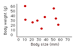

Click on thegraph that shows a positive relationship between body weight and body size?

Question 10
Question 11
tells you (a) that the number of individuals in the population depends on the per capita birth rate.
no -- in any graph, the thing that is plotted on the vertical (y) axis is
the "dependent" variable. So this graph tells you that birth rate depends
on N, not the other way around.
Click here to return to question 9.
tells you that (b) the per capita birth rate gets lower as time goes on.
no -- this graph tells you nothing about time. The horizontal axis is N,
or population size, not time. The first step in interpreting a graph is
always to figure out what the axes represent.
Click here to return to question 9.
tells you that (c) the per capita birth rate of each individual depends on the number of individuals in
the population.
Yes! the vertical or dependent axis is birth rate, so this graph means
that birth rate depends on N. Specifically, it tells you that the average
individual produces many kids when N is low, but only a few kids if N is high.
Click here to go to question 10.
tells you that d) the population's birth rate is high when the number of individuals in the population is low.
no -- you've correctly worked out that birth rate is the dependent
variable here, but "b" is the number of kids produced by an individual, not the number of births to the
whole population.
Click here to return to question 9.


Click on the graph that shows that the number of matings a bird gets is related to the
length of the bird's tail.
No, this graph shows no relationship between tail length and the number of maitings the bird
receives. If you look, the birds with the shortest tail lengths get the same number of matings
as the birds with the longest tail and the birds with the second longest tail get the most
matings.
Click here to return to question 10.
Yes, this graph shows that the shorter a bird's tail is the more matings the individual gets.
There is also another graph which shows a realtionship between tail length and maitings.
Click here to return to question 10.
Click here to return to question 11.
Yes, this graph shows that the longer a bird's tail is the more matings the individual gets.
There is also another graph which shows a realtionship between tail length and maitings.
Click here to return to question 10.
Click here to return to question 11.
No, this graph shows that no matter what the tail length of the bird is, they get the same number of matings.
Click here to return to question 10.


In Yellowstone National Park red fox coat color can be several different colors, including red, gray and black and it seems that the gray coat color is found most commonly in high elevation, and red coat colors are most common in low elevations. Click on the graph that supports this suggestion.
No, while this graph does show that red coat colors are most common in low elevations it also indicates that the gray coat color is most frequent at middle elevations and lowest at high elevations.
Click here to return to question 11.
No, this graph shows the opposite of what the question asked. In this graph the red coat color is most common in the high elevations (the tallest bar) and lowest at low elevations (the shortest bar), while the gray coat color is most frequent in the low elevations (the tallest bar) and lowest in the high elevations (the shortest bar).
Click here to return to question 11.
No, this graph indicates that the gray coat color is the most common at all elevations, its bar is always the tallest.
Click here to return to question 11.
Yes, this graph shows that the red coat is most frequent at low and middle elevations (the tallest bar) and lowest at high elevations (the shortest bar). The gray coat color on the other hand is most common in the high elevations (tallest bar) and least common in all other areas (shortest bar).

This is the end of the tutorial. Time to stroll on out of here, I hope that you found it helpful.
Return to the BIO364 home page.
Dr. Swanson's Web Page.

