ILOs
Maps are a graphic form for representing objects and phenomena on
the surface of the earth. Human vision has limited capability to
extract information from a map that simply depict the raw data. For
example, to show population distribution at the county level for the entire
United States, we can use one graphic symbol for each unique population
value, resulting in hundreds of different symbols that our eyes simply
can't tell apart. In order to overcome this problem, we can group
counties that share similar population values together and assign each
group a graphic symbol. We can limit the number of groups so that
we can effectively communicate the information.
This grouping process is called data classification. There are many techniques for classification. In fact, classification is a sub-field in mathematics. At the introductary level, we will mainly deal with three types, i.e., equal interval, quantile, and standard deviation. It is important to know that classification generalizes the data and inevitably reduce and distort the information content. Different maps can be generated simply by using different classification methods and different number of classes. With data classification, a map can tell some truths as well as lies.
Chapter 4 in Slocum gives excellent descriptions on each of the classification methods. This note gives some hightlights and complementary discussions.
Below is the table of 1990 population density (number of person per
square mile) for selected counties in Central Michigan. We will use
this data set to demonstrate the three data classification procedures.
| "Name" | "Popden90" |
| Lake | 14.937 |
| Osceola | 35.153 |
| Arenac | 40.514 |
| Clare | 43.379 |
| Gladwin | 42.399 |
| Bay | 249.510 |
| Midland | 143.315 |
| Isabella | 94.548 |
| Newaygo | 44.350 |
| Mecosta | 65.327 |
| Saginaw | 259.817 |
| Montcalm | 73.595 |
| Gratiot | 68.200 |
| Kent | 574.013 |
| Genesee | 662.925 |
| Shiawassee | 129.034 |
| Ionia | 98.281 |
| Clinton | 100.742 |
| Livingston | 197.534 |
| Ingham | 502.594 |
| Eaton | 160.411 |
| Barry | 86.774 |
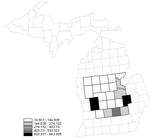
Equal interval
Steps for computing class limits:
1. Determine the class interval
Assume we want to group the 22 counties into 5 groups,
Class interval = range / (number of classes) = (662.925 - 14.937)/5 = 647.988/5 = 129.598
2. Determine the upper limit of each class
The first class starts with the lowest value, which is 14.937. The upper limit of the first class is calculated as 14.937 + 129.598 = 144.535.
3. Determine the lower limit of each class
For the second class and the subsequent classes, the low limits should be slightly greater than the previou upper limit. In the case for the second class, the low limit is 0.001 greater than 144.535. The upper limit is calculated as 144.536 + 129.598 = 274.134. We will keep using 0.001 as the margin between the upper limit and the lower limit of the subsequent class.
Results of 2 and 3
| Classes |
|
| 1 |
14.937 - 144.535
|
| 2 |
144.536 - 274.134
|
| 3 |
274.135 - 403.733
|
| 4 |
403.734 - 533.332
|
| 5 |
533.333 - 662.931
|
4. Specify the actual class limits for mapping
This step involves the rounding of the class limits. It is necessary only when the limits calculated in steps 2 and 3 have higher precision than the original data.
5. Determine the class assignment
Use the class limits, we can now assign each county to a particular
class. The result is in the table.
| "Name" | "Popden90" | Equal interval |
| Lake | 14.937 | 1 |
| Osceola | 35.153 | 1 |
| Arenac | 40.514 | 1 |
| Clare | 43.379 | 1 |
| Gladwin | 42.399 | 1 |
| Bay | 249.510 | 2 |
| Midland | 143.315 | 1 |
| Isabella | 94.548 | 1 |
| Newaygo | 44.350 | 1 |
| Mecosta | 65.327 | 1 |
| Saginaw | 259.817 | 2 |
| Montcalm | 73.595 | 1 |
| Gratiot | 68.200 | 1 |
| Kent | 574.013 | 5 |
| Genesee | 662.925 | 5 |
| Shiawassee | 129.034 | 1 |
| Ionia | 98.281 | 1 |
| Clinton | 100.742 | 1 |
| Livingston | 197.534 | 2 |
| Ingham | 502.594 | 4 |
| Eaton | 160.411 | 2 |
| Barry | 86.774 | 1 |
Below is the corresponding map.
What are the advantages and disadvantages of equal interval classification? (page. 67)
Quantile
Quantile classification puts equal number of observations (county population density) in each class according to the ranks.
1. Calculate the number of observations in each class
Number of observations = (Total number of observations) / (number of
classes)
= 22 / 5 = 4.4
Since the number of observations is not an integer, we can assign the
number of classes in the following manner: class 1 - four observations;
class 2 - five observations; class 3 - four observations; class 4 - five
observations; class 5 - four observations.
2. Rank the data
3. Assign classes
Below is the result.
| "Name" | "Popden90" | Quantile class |
| Lake | 14.937 | 1 |
| Osceola | 35.153 | 1 |
| Arenac | 40.514 | 1 |
| Gladwin | 42.399 | 1 |
| Clare | 43.379 | 2 |
| Newaygo | 44.350 | 2 |
| Mecosta | 65.327 | 2 |
| Gratiot | 68.200 | 2 |
| Montcalm | 73.595 | 2 |
| Barry | 86.774 | 3 |
| Isabella | 94.548 | 3 |
| Ionia | 98.281 | 3 |
| Clinton | 100.742 | 3 |
| Shiawassee | 129.034 | 4 |
| Midland | 143.315 | 4 |
| Eaton | 160.411 | 4 |
| Livingston | 197.534 | 4 |
| Bay | 249.510 | 4 |
| Saginaw | 259.817 | 5 |
| Ingham | 502.594 | 5 |
| Kent | 574.013 | 5 |
| Genesee | 662.925 | 5 |
And the corresponding map:

What's advantage and disadvantages of quantile classification? (page
67-69)
Standard Deviation
In this method, the standard deviation is used to compute the class
limits. One may use any units of standard deviations for calculating
the class limits. The best way to understand this method is to use
the following illustration:
For our example, the standard deviation is ±177.686 and the mean is 167.607. We can first subtract the mean by 1 unit of standard deviation. 167.607 - 177.686 = -10.08, which is way below the minimum population density in our data set. There is no need to subtract -10.08 to get another class further to the left of the mean.
We now will add one standard deviation to the mean. 167.607 + 177.686 = 345.293, which still smaller than the maximum population density. We hence add another unit of standard deviation to 345.293 to produce another class. Use the procedure we generated the table below:
class 1: -10.08 to 167.607 (one standard deviation below the mean)
class 2: 167.607 (the mean)
class 3: 167.607 to 345.293 (one standard deviation above the mean)
class 4: 345.293 to 522.98 (two standard deviation above the mean)
class 5: 522.98 to 700.266 (three standard deviation above the mean)
Note that the number of classes is determined by the characteristics of the data and is not artificially determined. One can use a fraction of the standard deviation to calculate the classes, which will produce more classes.
Below is the corresponding map:
What's advantages and disadvantages of standard deviation classification
method? (page 69)
Exercises
1. Classify the following data set into three groups using equal interval,
quantile, standard deviation (1 standard deviation) respectively.
| Data | Equal interval | Quantile | Standard deviation |
| 1.2 | |||
| 3.4 | |||
| 1 | |||
| 5 | |||
| 0.5 | |||
| 2.3 | |||
| 5.6 | |||
| 3.9 | |||
| 6.7 | |||
| 2.6 | |||
| 8.2 | |||
| 1.5 |
2. Make a map showing the population density by counties (L:\esri\esridata\us\counties.shp)
in the United States, using three different types of classification method.
Use gray level (gray monochromatic) for the legend. Do not use color.
Edit the maps with careful design. Publish the maps to the Web.